

[free_download_btn]
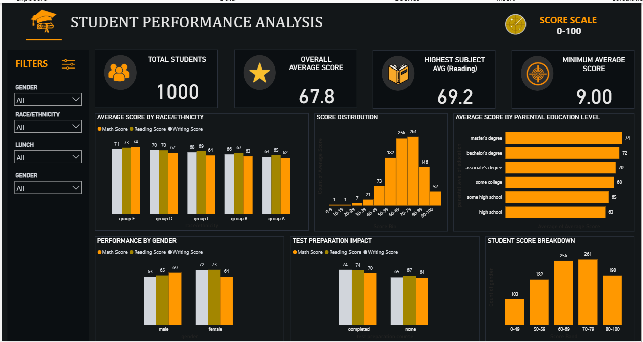
Education data has always struck me as one of the more emotionally loaded datasets you can work with, because behind every number is a real kid and a real set of circumstances. For this project I pulled a dataset of 1,000 student records covering math, reading, and writing scores, along with demographic and background details like gender, race and ethnicity, parental education level, and whether the student completed a test preparation course. I built a Power BI dashboard around it to see what patterns actually hold up once you look past the averages.
The dataset came from Kaggle, and I built the dashboard with filters for gender, race and ethnicity, and lunch type so anyone exploring it can slice the data down to a specific group and see how the numbers shift.
Key Performance Overview
Across the full sample of 1,000 students, the overall average score sits at 67.8 on a 0 to 100 scale. Reading came out as the highest performing subject with an average of 69.2, and the lowest average score recorded for any student was 9.00, which shows there's real spread in this dataset rather than everyone clustering near the middle.
Average Score by Race and Ethnicity
Breaking scores down by race and ethnicity shows a fairly consistent gap between groups. Group E leads with scores in the low 70s across math, reading, and writing, while group A sits noticeably lower, in the low to mid 60s. Groups D, C, and B fall in between in that order. The pattern here isn't dramatic swings, it's a steady gradient, which suggests whatever is driving these differences is systemic rather than a one-off anomaly in the data.
Score Distribution
The distribution of average scores across all 1,000 students is skewed toward the middle to upper range. Very few students fall below 30, but the counts climb sharply through the 50 to 79 range, peaking at 261 students scoring between 70 and 79, before dropping off again above 80. This tells you the bulk of the student population is performing in a solid middle band, with strong performance being far more common than either failure or excellence.
Average Score by Parental Education Level
This is where one of the clearest patterns in the whole dashboard shows up. Students whose parents hold a master's degree average 74, and that number steps down almost perfectly as parental education decreases, landing at 63 for students whose parents have a high school education. It's a clean, almost linear relationship, and it's hard to look at without thinking about how much home environment and access to resources shape academic outcomes long before a test is ever taken.
Performance by Gender
Gender breaks down differently depending on the subject. Male students score higher in writing at 69 compared to 64 for females, but female students pull ahead in reading, 73 versus 65, and again in math, 72 versus 63. Rather than one gender simply outperforming the other, this points to different subject strengths playing out along gender lines.
Test Preparation Impact
Test prep completion has a real, though not dramatic, effect. Students who completed a test preparation course scored 74 in both math and reading and 70 in writing, compared to 65, 67, and 64 for students who didn't. The gap holds across every subject, which suggests preparation courses aren't just helping with one skill but giving a broad, consistent lift.
Methodology: Tools and Approach
This dashboard was built in Power BI using a combination of visuals suited to comparing groups and tracking distributions.
Key techniques used include:
- KPI cards for total students, overall average score, top subject, and minimum score
- Grouped bar charts comparing math, reading, and writing scores by race, gender, and test prep status
- A histogram-style bar chart for score distribution across bins
- A horizontal bar chart for average score by parental education level
- Interactive slicers for gender, race and ethnicity, and lunch type
Key Takeaways
- Score differences across race and ethnicity groups follow a steady gradient rather than sharp jumps
- Most students land in the 50 to 79 score range, with very few extreme low or high scorers
- Parental education level shows a near-linear relationship with student performance
- Gender differences aren't uniform, with each gender showing strength in different subjects
- Completing a test prep course consistently boosts scores across all three subjects
Conclusion
Working through this dataset was a reminder that academic performance data rarely tells one simple story. It's shaped by background, preparation, and factors that show up as steady patterns rather than dramatic outliers. If you want to explore the dataset yourself, you can find it on Kaggle here: https://www.kaggle.com/datasets/sadiajavedd/students-academic-performance-dataset.
- Version
- Download 72
- File Size 470.60 KB
- File Count 11
- Create Date September 22, 2026
- Last Updated September 22, 2026
| File | Action |
|---|---|
| StudentsPerformance.csv | Download |
| Link.txt | Download |
| PEOPLE_orange-removebg-preview.png | Download |
| STAR-removebg-preview.png | Download |
| BOOK-removebg-preview.png | Download |
| ChatGPT_Image_Sep_6__2026__08_03_28_PM-removebg-preview.png | Download |
| GRADUATION_orange-removebg-preview.png | Download |
| FILTERS_ICON_orange-removebg-preview.png | Download |
| RADAR.jpg | Download |
| RADAR-removebg-preview.png | Download |
| Student Performance Analysis.png | Download |


