

[free_download_btn]
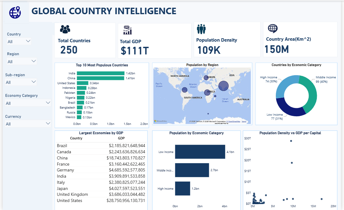 Every so often you come across a dataset that's less about spotting a niche trend and more about seeing the shape of the entire world at once. That's what drew me to this Global Country Intelligence dataset, which covers 250 countries with details on population, GDP, region, sub-region, economic category, and currency. I built a Power BI dashboard around it to see how population and wealth actually distribute across the globe, since the two don't always move together the way you'd expect.
The dataset came from Kaggle, and the dashboard includes filters for country, region, sub-region, economic category, and currency, so you can drill down to a specific slice of the world at any point.
Key Performance Overview
Across all 250 countries, total GDP comes in at $111 trillion, with an average population density of 109K and total country area of 150 million square kilometers. Those numbers set the stage, but the real story shows up once you start breaking things down by country and income category.
Top 10 Most Populous Countries
India and China sit almost neck and neck at the top, with 1.42 billion and 1.41 billion people respectively, far ahead of the rest of the list. The United States comes in a distant third at 340 million, followed by Indonesia at 280 million and Pakistan at 240 million. What's striking here is the drop off after the top two. India and China alone account for population figures that dwarf every other country on the list combined in some cases, which says a lot about how concentrated the world's population actually is.
Population by Region
Mapping population by region shows heavy concentration in Asia, with visibly smaller population clusters across Europe, Africa, and the Americas by comparison. It's a useful visual reminder that global population isn't spread evenly by geography, it's clustered in specific pockets of the map far more than most people picture when they think about world population.
Countries by Economic Category
Out of 250 countries, 99 fall into the middle income category, 77 are low income, and 74 are high income. So middle income countries make up the largest single group at 40 percent, but low and high income countries are surprisingly close in count, at 31 and 30 percent respectively. There isn't a dominant tier here, the world splits fairly evenly across the three categories in terms of country count.
Largest Economies by GDP
Looking at GDP by country, the United States leads by a wide margin at $28.75 trillion, more than double China's $18.74 trillion, which is the next closest economy. From there the numbers drop sharply, with Germany at $4.69 trillion and Japan at $4.03 trillion trailing well behind the top two. This gap between the top two economies and everyone else is a good example of how global GDP doesn't decline gradually, it falls off a cliff after a small handful of dominant economies.
Population by Economic Category
This is where the dashboard gets genuinely interesting. Despite low income countries making up only 77 out of 250, they account for 4.1 billion people, the largest population share by far. Middle income countries hold 2.7 billion, and high income countries, despite having a similar country count to low income nations, hold just 1.2 billion people. In other words, the majority of the world's population lives in countries that fall outside the high income bracket, which flips the usual assumption that most people live in wealthier nations.
Population Density vs GDP per Capita
The scatter plot comparing population density against GDP per capita shows most countries clustered tightly at lower density and lower GDP levels, with only a small number of outliers reaching higher GDP figures. There's no clean upward relationship between how densely populated a country is and how wealthy it is per person, which suggests density alone isn't a reliable predictor of economic output.
Methodology: Tools and Approach
This dashboard was built in Power BI using visuals designed to compare countries, regions, and income categories at multiple levels.
Key techniques used include:
- KPI cards for total countries, total GDP, population density, and country area
- A horizontal bar chart ranking the most populous countries
- A map visual showing population distribution by region
- A donut chart for countries by economic category
- A table listing the largest economies by GDP
- A bar chart for population by economic category
- A scatter plot comparing population density against GDP per capita
- Interactive slicers for country, region, sub-region, economic category, and currency
Key Takeaways
- India and China together represent a massive share of global population, far ahead of every other country
- Countries split fairly evenly across low, middle, and high income categories by count
- The United States and China dominate global GDP, with a steep drop off after them
- Most of the world's population lives in low and middle income countries, not high income ones
- Population density shows no strong relationship with GDP per capita
Conclusion
Working through this dataset was a reminder of how differently the world looks depending on whether you're counting people or counting dollars. Wealth and population concentrate in very different places, and a dashboard like this makes that gap impossible to miss. If you want to explore the dataset yourself, you can find it on Kaggle here: https://www.kaggle.com/datasets/prathamharer/global-country-intelligence-dataset.
- Version
- Download 21
- File Size 238.56 KB
- File Count 3
- Create Date September 22, 2026
- Last Updated September 22, 2026
