

[free_download_btn]
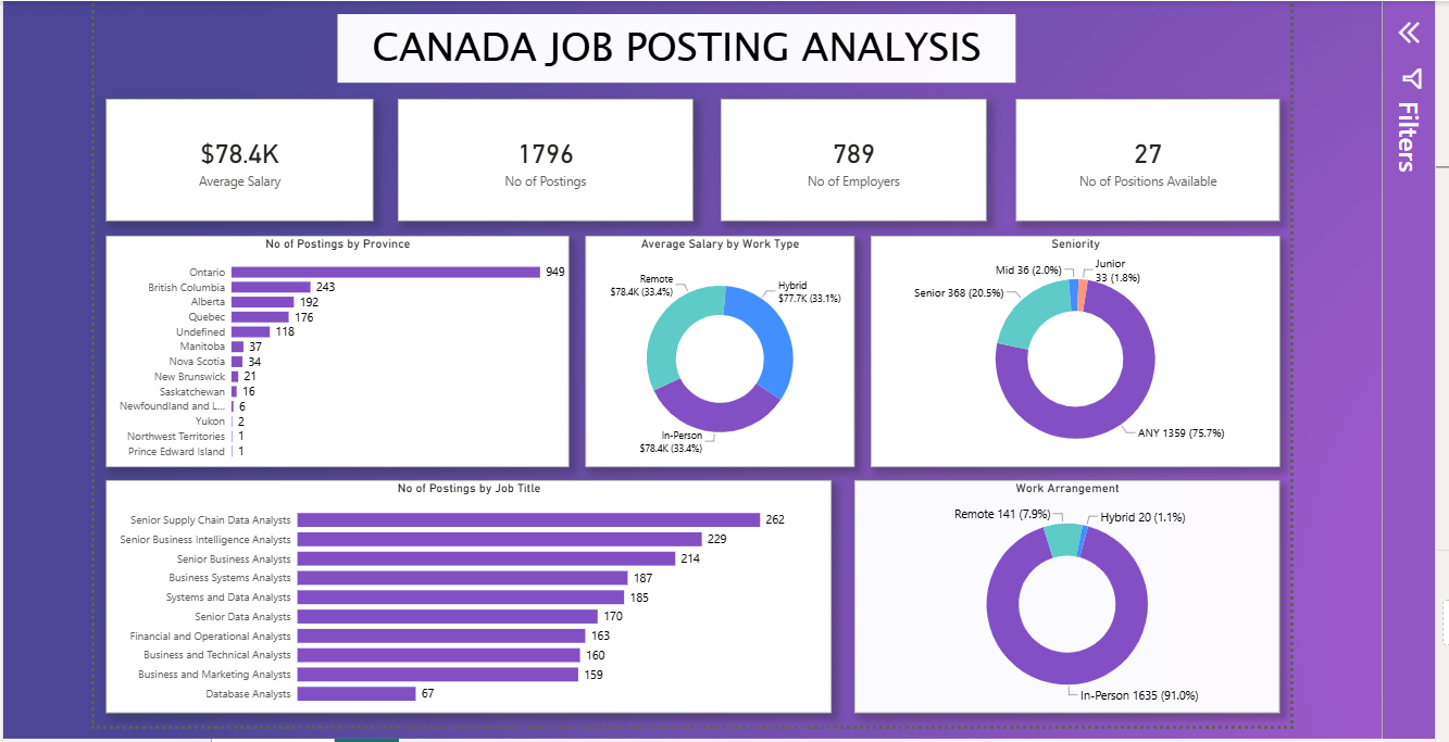
I built this Power BI dashboard to get a clearer picture of the data analyst job market in Canada. Rather than looking at individual job listings one by one, I wanted to see where the opportunities are concentrated, which roles appear most frequently, how salaries compare across work types, and what the seniority mix looks like.
The dataset comes from Aman Bhattarai's Data Analyst Job Roles in Canada project on Kaggle. The underlying project involved collecting job postings from Indeed and Glassdoor, followed by data cleaning and transformation before the dataset was published for analysis. amanbhattarai.com.np
I used Microsoft Power BI to turn that dataset into an interactive dashboard that makes these patterns easier to explore.
2. Key Performance Overview
At a glance, the dashboard contains 1,796 job postings from 789 employers, with an average salary of $78.4K. It also shows 27 positions available in the selected dataset view. These numbers provide a useful starting point, but the more interesting story comes from looking at where those postings are located, which job titles dominate, and how the roles are structured.
3. A Breakdown of the Major Visuals
Job Postings by Province
The geographic distribution is heavily concentrated in Ontario. Ontario accounts for 949 postings, far ahead of British Columbia with 243, Alberta with 192, and Quebec with 176. The remaining provinces and territories have considerably smaller numbers.
Ontario alone represents more than half of the postings displayed, which makes the provincial distribution one of the clearest patterns in the dashboard. For someone exploring opportunities across Canada, the difference between Ontario and the next largest provinces is particularly noticeable.
Job Postings by Job Title
The job title breakdown reveals an interesting mix of specialized and broader analyst roles. Senior Supply Chain Data Analysts lead with 262 postings, followed by Senior Business Intelligence Analysts with 229 and Senior Business Analysts with 214.
Business Systems Analysts also appear strongly with 187 postings, while Systems and Data Analysts account for 185. At the other end of the chart, Database Analysts have 67 postings.
The pattern suggests that the demand represented in this dataset extends beyond the conventional "Data Analyst" title. Business intelligence, supply chain, systems, and business analysis roles are all significant parts of the market.
Seniority Distribution
The seniority donut tells another important part of the story. 1,359 postings, or 75.7%, are labelled "ANY." Senior positions account for 368 postings, or 20.5%, while Mid positions represent 36 postings (2.0%) and Junior positions 33 postings (1.8%).
The large "ANY" category is important when interpreting this chart. It means most postings in the dataset do not specify a particular seniority level, so the smaller Junior and Mid categories should not be interpreted as representing the entire entry-level market.
Average Salary by Work Type
The salary comparison is surprisingly close. Remote positions show an average salary of $78.4K, In-Person positions also show $78.4K, while Hybrid positions average $77.7K.
There is therefore very little difference in average salary across the three work types represented here. The chart challenges the assumption that one particular working arrangement automatically comes with a substantially higher salary.
Work Arrangement
The work arrangement distribution is much less balanced than the salary chart. In-Person roles dominate with 1,635 postings, or 91.0%. Remote positions account for 141 postings (7.9%), while Hybrid positions make up just 20 postings (1.1%).
So while salaries are relatively similar across work types, the availability of those work arrangements is very different within this dataset.
4. Methodology: Tools and Approach
- KPI cards for average salary, postings, employers, and available positions
- Horizontal bar charts for provinces and job titles
- Donut charts for seniority and work arrangement
- Donut chart for average salary by work type
- Data labels to make individual values immediately readable
- Power BI filtering through the dashboard's filter pane
- Data cleaning and transformation before visualization, consistent with the dataset creator's published workflow amanbhattarai.com.np
5. Key Takeaways
- Ontario accounts for 949 of the 1,796 postings, making it the largest provincial market in this dataset.
- Senior Supply Chain Data Analyst roles have the highest posting count at 262.
- 75.7% of postings are labelled "ANY" for seniority, so most listings do not specify a particular experience level.
- In-Person roles make up 91.0% of the postings shown.
- Average salaries are remarkably similar, ranging from $77.7K for Hybrid to $78.4K for Remote and In-Person.
- The job market represented here covers a much broader range of analyst roles than simply traditional Data Analyst positions.
6. Conclusion
This project reinforced something I find important when building dashboards: the goal is not to fill a page with charts, but to make the important patterns easy to notice and understand. A few well-chosen visuals can reveal differences in location, job demand, seniority, salary, and working arrangements without making the dashboard difficult to read.
The project also reminded me to pay attention to how categories are defined. For example, the large "ANY" seniority category changes how the seniority chart should be interpreted. Good data storytelling is not just about presenting numbers. It is also about giving those numbers the right context.
- Version
- Download 8
- File Size 1.15 MB
- File Count 4
- Create Date September 22, 2026
- Last Updated September 22, 2026
